
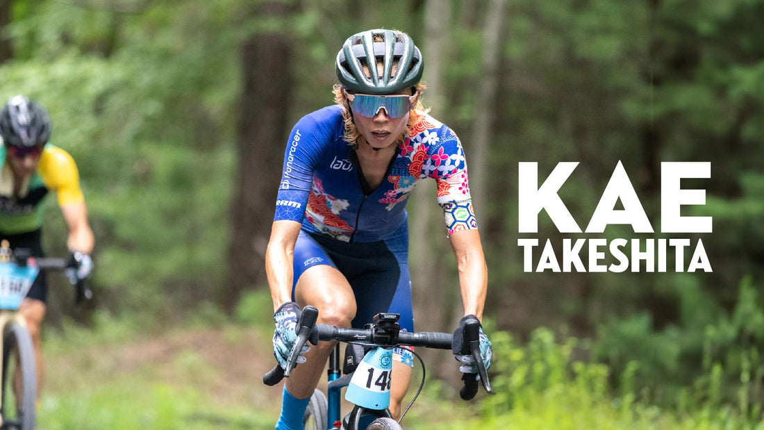
I’ve used this custom kit design for a few years now. The design taps into my heritage and when working with Eliel, I chose to apply more vibrant and pop colors to make it more modern than strictly traditional.
I incorporated a combination of pine, bamboo and plum, symbols of celebration and auspiciousness in Japan (松竹梅) known as the Three Friends of Winter (歳寒三友). These 3 plants do not wither in winter; pines and bamboos stay green and plums bloom when it’s still cold. They are symbols of resilience and perseverance.
Both cherry blossom and chrysanthemum are very important and cherished flowers in Japan.
 The continuation of circles is a Japanese traditional pattern called Shippou. It spells 七宝 (= literally “seven treasures”), and the seven treasures/gems appear in the ancient Buddhist literatures. As a pattern, Shippou's endlessly linked circles mean harmony and peace. Depending on how you look at them, they look like circles, stars, or flowers. There are many variations of Shippou patterns.
I put my name on my kit, in one of the ancient fonts that still is utilized in the present time, for things such as seals for official documents, etc. I think it’s a nice accent.

A wave pattern (青海波 = blue ocean waves) was used both on jerseys and collars of vest / jacket. It’s one of the most common traditional patterns, and it goes well in any color.

